Google Material Design 3 Guides & Resources
When working with Google Material Design 3, the latest design language from Google that blends bold color, flexible layout and adaptive components for modern apps. Also known as Material You, it lets designers and developers create personalized experiences across Android, web and other platforms.
One of the core ideas behind Material Theming, a method that extracts brand colors into dynamic palettes for every screen is that UI should feel like it belongs to the user. Design Tokens, named values for colors, spacing and typography that drive component styling supply the data that Material Theming needs. In practice, Google Material Design 3 encompasses dynamic color theming, responsive layouts and accessibility defaults, which means a single design system can power phones, tablets and wearables without extra work. Developers who use Jetpack Compose, Android’s modern UI toolkit that lets you write UI in Kotlin code get direct access to Material components, while designers on Figma, a cloud‑based design tool that supports shared libraries and design tokens can sync those tokens instantly. This tight loop of token‑driven theming, component libraries and real‑time preview is why Material Design 3 feels faster to iterate.
Why Material Design 3 matters for every project
First, accessibility isn’t an afterthought. The system ships with contrast‑aware color palettes, scalable typography and motion guidelines that meet WCAG standards out of the box. Second, the component catalog grew to include updated navigation bars, refreshed buttons and new cards that automatically adapt to the user’s wallpaper on Android 12+. Third, the design‑to‑code handoff shrank dramatically because tokens live in both design files and code libraries, so a change in Figma instantly reflects in a Compose preview. Finally, the ecosystem is open‑source; the Material Components libraries for Android, iOS and Web let teams reuse the same visual language across all products. All of these pieces—dynamic theming, token‑driven styling, cross‑platform components, built‑in accessibility—form a cohesive workflow that speeds up delivery and raises quality.
Below you’ll find a curated list of posts that dive into real‑world use cases, from building responsive dashboards with Material components to tweaking design tokens for brand consistency. Whether you’re a UI designer polishing a mobile mockup or a developer integrating the latest toolbar in an existing app, the articles ahead give practical steps, code snippets and design recommendations that line up with the principles explained here. Let’s jump into the collection and see how the community applies Google Material Design 3 to everyday challenges.
 16 October 2025
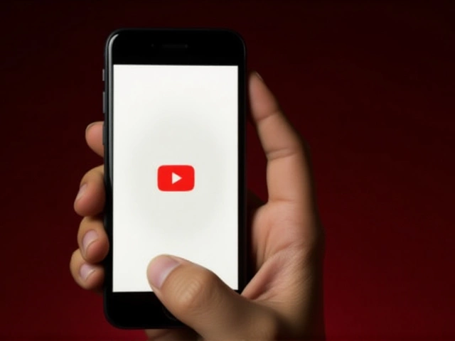
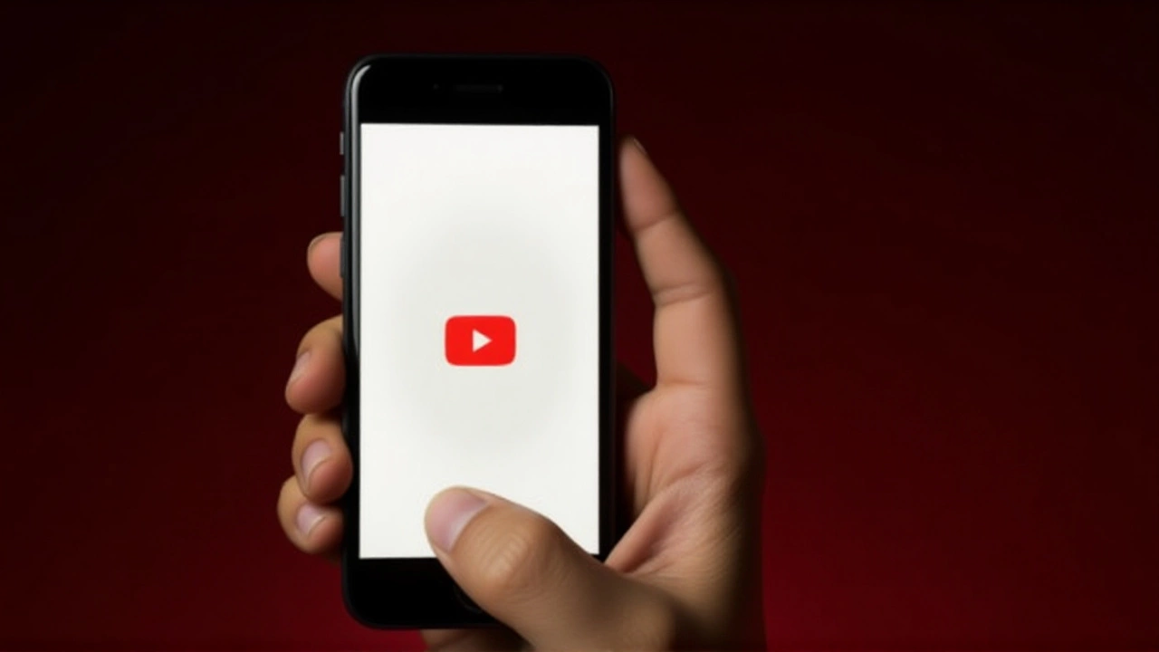
YouTube Redesign Rolls Out Globally with New Controls, Like Animations and Threaded Comments
YouTube rolls out its biggest player redesign in a decade, adding sleek controls, animated likes and threaded comments as TV becomes its top viewing device.